StoryBook v10.1 基本用法
TIP
之前有幸在 vue3 + vite 的项目中使用了 storybook,过程一言难尽,Storybook 7.0 Beta Vue3踩坑随笔
template 语法文档写的要吐了,而且可能是 vite 刚出没多久的原因,各种踩坑。
今天使用 react + vite 再次探索一下 StoryBook。
安装还是比较简单的。首页 找到对应的框架,在项目根目录执行对应的命令即可。
pnpm create storybook@latest无脑下一步后,会在对应的根目录创建 .storybook 目录,以及 package.json 中也会增加对应的依赖及启动和打包指令。
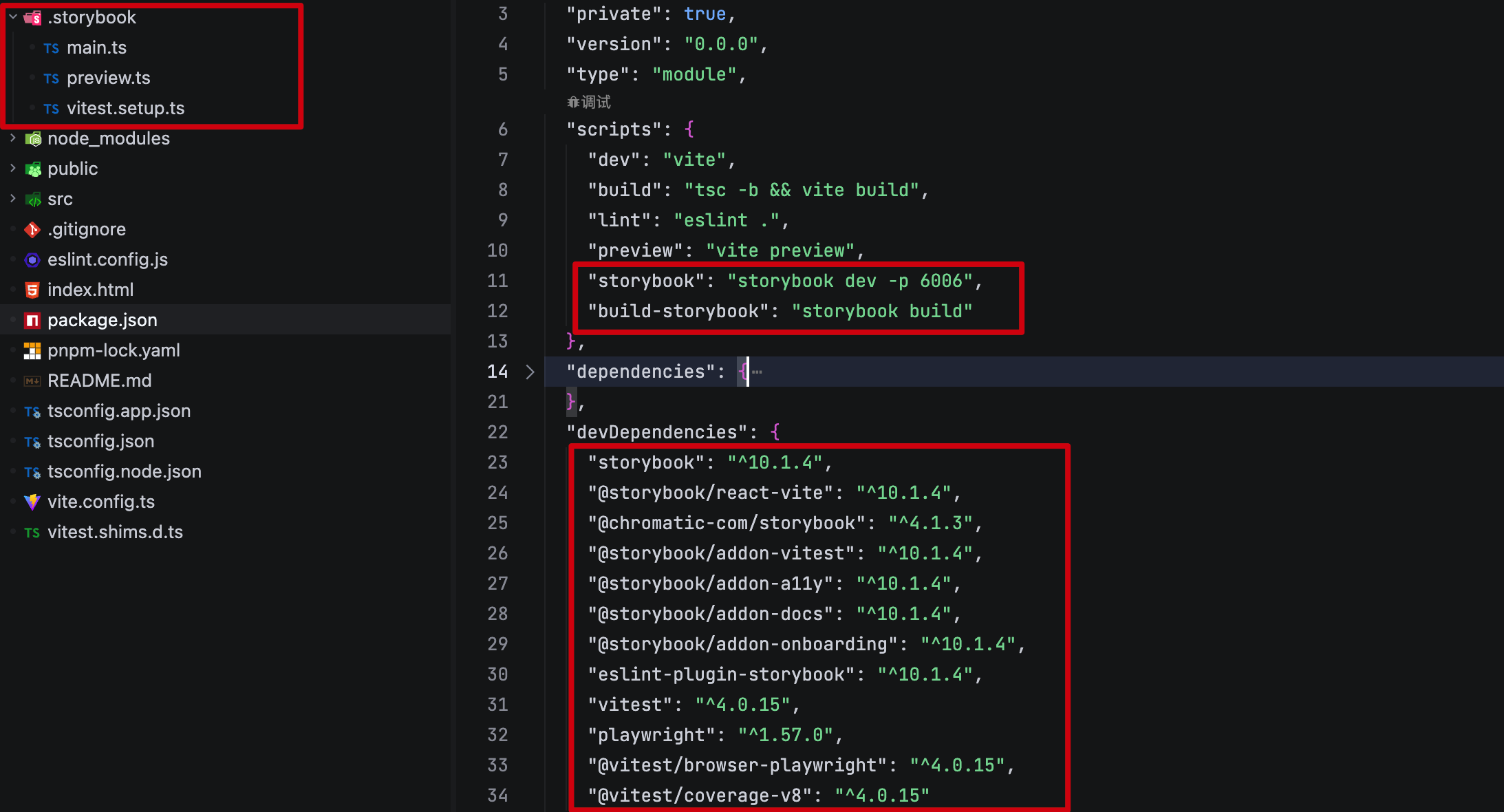
最终的一点是,它会在 src 目录下创建 stories 目录,用于存放组件的 story 文件。 可以在 .storybook/main.ts 中配置对应的路径。
const config: StorybookConfig = {
  "stories": [
    "../src/**/*.mdx",
    "../src/**/*.stories.@(js|jsx|mjs|ts|tsx)"
  ],
  "addons": [
    // ....
  ],
  "framework": "@storybook/react-vite"
};
export default config;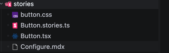
Configure.mdx 可以用于编写组件库的文档,可以新增多个。 关于 mdx 的支持参考 MDX
同样的 MDX 中也支持各种组件 组件列表
所以,组件也是支持用 .mdx 文件来编写的,只不过不太推荐罢了。
import { Meta, ArgTypes } from "@storybook/addon-docs/blocks";
import * as ButtonStories from './Button.stories';

{/* 边栏的名称 */}
<Meta title="StoryBook v10.1 基本用法" />
{/* 展示组件的各种参数 */}
<ArgTypes of={ButtonStories} />

## 基本用法
StoryBook 是一个用于编写组件库文档的工具。 ... ...
*.stories.ts 则是用于编写组件的 story 文件。
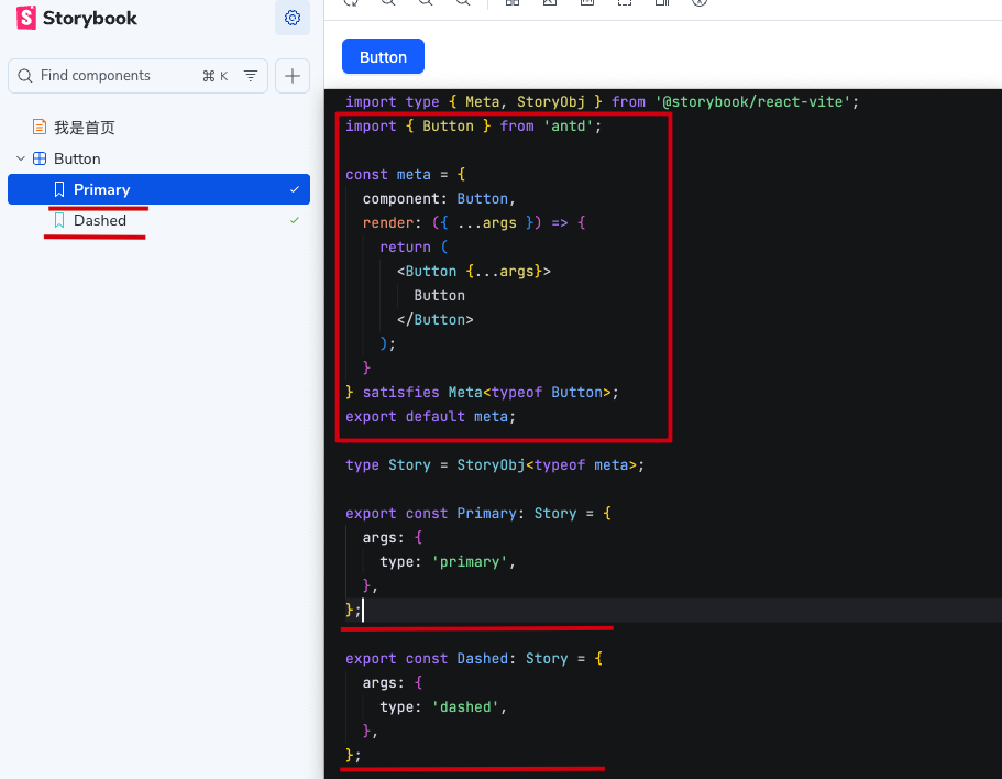
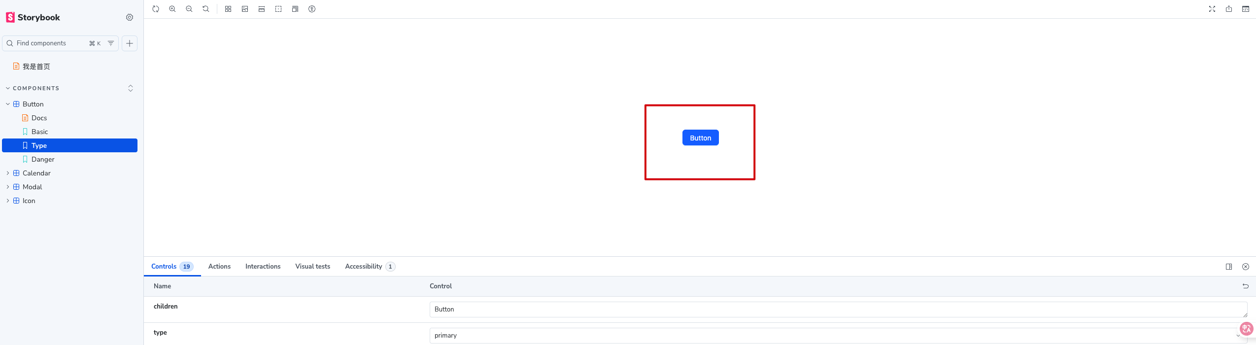
可以看出每个 Story 对应到页面中都是组件下的一个菜单。 且 Story 中的 args 会被当做参数传递到组件中。
Args 组件参数
args 的 key 实际上就是组件的 props 名称。可以传递任意值
export const Primary: Story = {
  args: {
    type: 'primary',
    icon: <SyncOutlined />,
  },
};
argTypes 参数约束
如果需要约束 args 的值,需要在 ArgTypes 中配置。在 meta 中声明组件通用的 argTypes
const meta = {
  component: Button,
  argTypes: {
    type: {
      control: { type: 'select' },
      options: ['primary', 'dashed', 'link', 'text', 'default'],
      description: '按钮类型',
    }
  },
  render: ({ ...args }) => {
    return (
      <Button {...args}>
        Button
      </Button>
    );
  }
} satisfies Meta<typeof Button>;
约束的条件主要来源于 control 方案也是多中多样。文档
| control type | 说明 |
|---|---|
select | 下拉选择配合 options 来约束值 |
multi-select | 多选下拉选择配合 options 来约束值 |
inline-radio | 内联单选配合 options 来约束值 |
radio | 单选配合 options 来约束值 |
inline-check | 内联多选配合 options 来约束值 |
check | 多选配合 options 来约束值 |
boolean | 布尔值 |
number | 提供一个数值输入,包含所有可能的值,min 最小值,max 最大值,step 步长 |
range | 提供一个滑块,min 最小值,max 最大值,step 步长 |
file | 上传文件 { type: 'file', accept: '.png' } |
object | 提供一个对象输入 |
color | 提供一个颜色选择器 { type: 'color', presetColors: ['red', 'green']} |
date | 提供一个日期选择器 |
text | 提供一个文本输入框 |
// 业务无关,纯演示
argTypes: {
  type: {
    control: { type: 'select' },
    options: ['primary', 'dashed', 'link', 'text', 'default'],
  },
  color: {
    control: { type: 'color', presetColors: ['#1890FF', '#40A9FF', '#69C0FF'] },
  },
  file: {
    control: { type: 'file', accept: 'image/*' },
  },
  progress: {
    control: { type: 'range', min: 0, max: 100, step: 1 },
  }
},
INFO
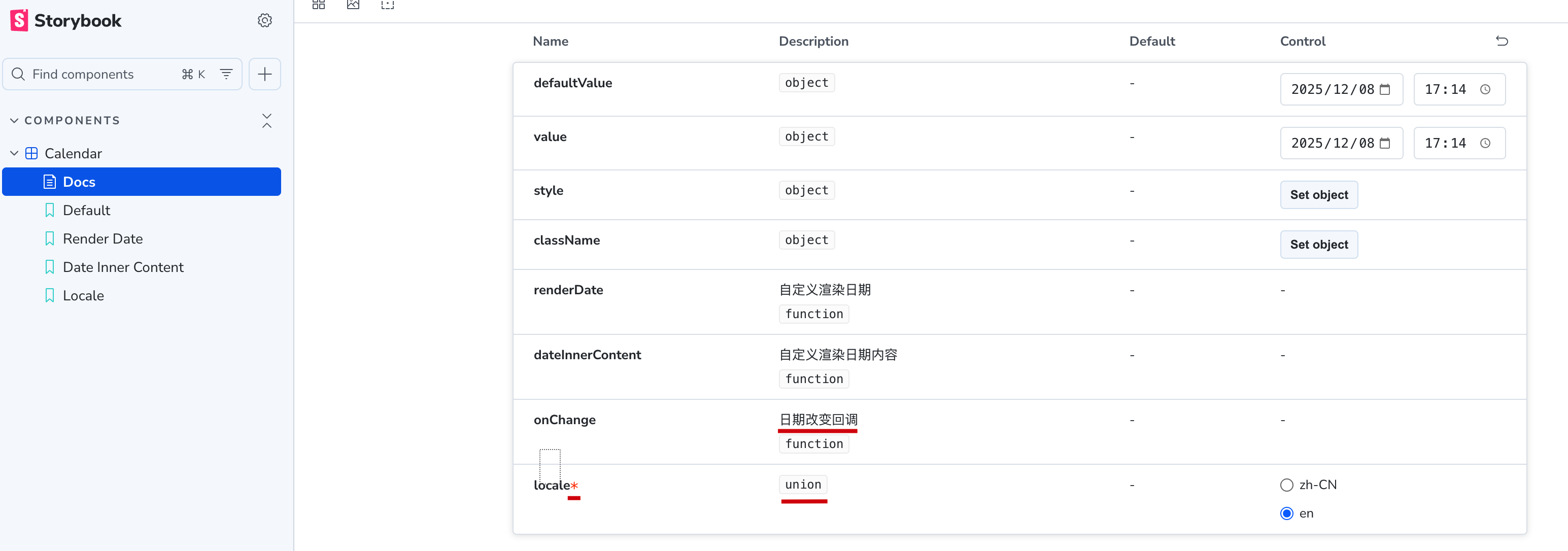
对于 事件和 ReactNode 类型的 props,支持仍然不是那么友好。必须使用通用的 object 类型。
它更像是一本故事书,应该在每个 story 中展示组件的使用场景。
对于快速展示组件以及业务组件的使用,非常有效。如果要 antd 类似的组件库,反而会显得有些力不从心
defaultValue 默认值
关于默认值,defaultValue 属性已经废弃,建议直接使用 args 来设置默认值
const meta = {
  component: Example,
  argTypes: {
    value: {
      // ❌ Deprecated
      defaultValue: 0,
    },
  },
  // ✅ Do this instead
  args: {
    value: 0,
  },
} satisfies Meta<typeof Example>;
type 类型标注
const meta = {
  argTypes: {
    type: {
      control: { type: 'select' },
      options: ['primary', 'dashed', 'link', 'text', 'default'],
      // 类型生成的有一些问题,value 无论如何声明都会类型错误
      type: { name: 'union', value: [], required: true }
    },
    onClick: {
      // 禁止用户手动修改
      control: { type: 'object', disable: true },
      // 声明 onClick 是一个函数类型
      type: 'function',
      // 文档的描述
      description: '点击事件',
    }
  },
} satisfies Meta<typeof Button>;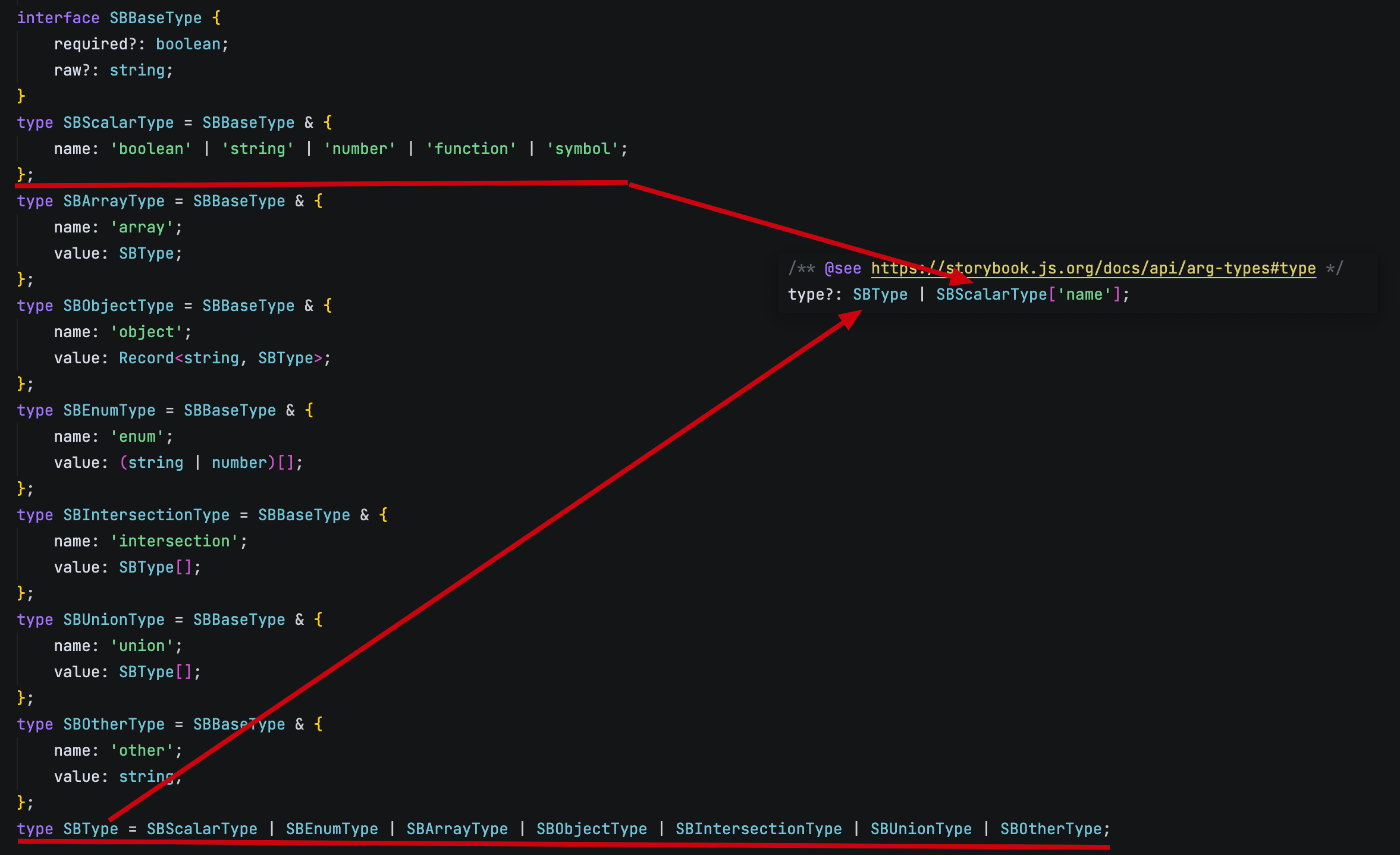
可以看出如果是一些基础的类型可以直接声明,如果是 array 这写复杂的类型则需要用对象声明。
如果使用对象,他们的 value 又都指向了 SBType。
假设用了 union 类型,value 又是 SBType 的数组,导致无限循环。
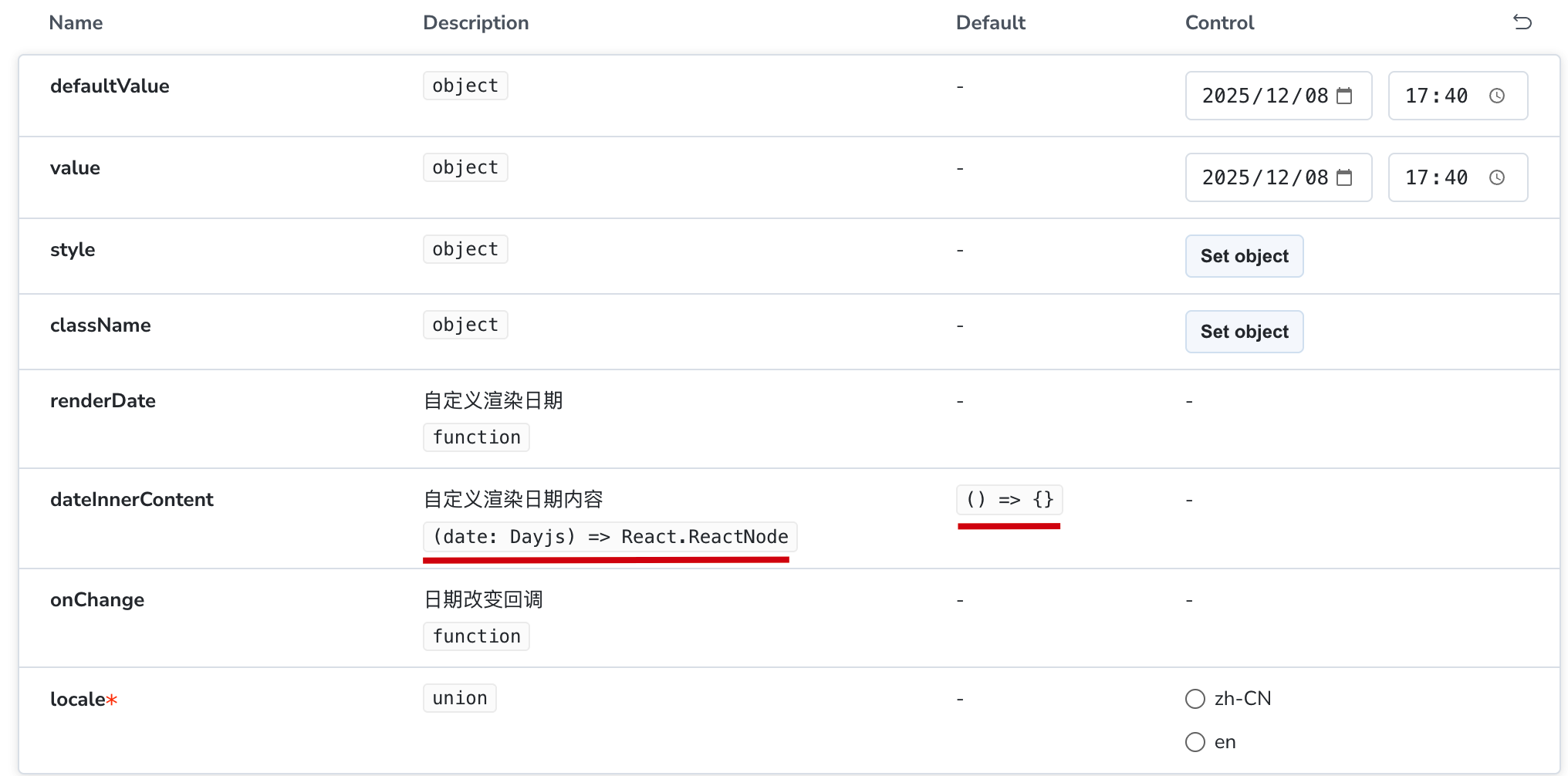
table 默认值和参数描述的最强形态
可以不再使用 type 和选择性使用 description 来展示参数的类型和描述
const meta = {
  argTypes: {
    dateInnerContent: {
      control: { type: 'object', disable: true },
      description: '自定义渲染日期内容',
      // type: 'function',
      table: {
        defaultValue: { summary: '() => {}' },
        type: { summary: '(date: Dayjs) => React.ReactNode' }
        disable: true, // 控制该参数是否在文档中展示
      }
    }
  }
}
由于声明的类型和默认值都是字符串的缘故,所以无论怎么书写都不会错误,到文档中会被转换成 code 输出。必要时配合 description 直接王炸。
同级的 type 属性则可以直接被丢弃了。
tags
autodocs 自动生成文档
文档 可以通过给 meta 增加 tags 来开启自动文档。
一般情况下都会在全局进行配置
// .storybook/preview.ts
const preview: Preview = {
  tags: ['autodocs'],
};
文档中的内容会将所有的 story 以及所有的 control 都展示出来。文档的默认主题以第一个 story 为准。
const meta = {
  component: Button,
  tags: ['autodocs'],
  argTypes: {
    type: {
      control: { type: 'select' },
      options: ['primary', 'dashed', 'link', 'text', 'default'],
    },
  },
  render: ({ ...args }) => {
    return (
      <Button {...args}>
        Button
      </Button>
    );
  }
} satisfies Meta<typeof Button>;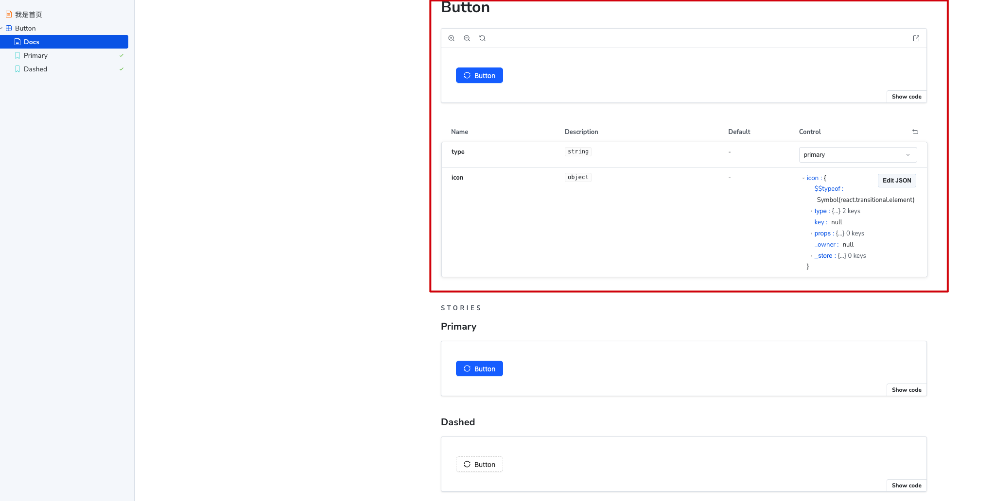
可以在 main.ts 中配置文档的默认名称以及边栏的显示规则
const config: StorybookConfig = {
  framework: '@storybook/your-framework',
  stories: ['../src/**/*.mdx', '../src/**/*.stories.@(js|jsx|mjs|ts|tsx)'],
  addons: ['@storybook/addon-docs'],
  docs: {
    defaultName: 'Documentation', // 文档的默认名称
    docsMode: true, // true 则只展示文档,不显示 story 的边栏
  },
};
parameters
layout 布局
文档 有一个关于布局的参数 layout,可以用来配置组件显示区域的布局。
const meta = {
  component: Button,
  render: ({ ...args }) => {
    return (
      <Button {...args}>
        Button
      </Button>
    );
  },
  parameters: {
    layout: 'centered', // 居中布局
  },
} satisfies Meta<typeof Button>;centered居中布局padded有一定的内边距,默认值fullscreen按原样显示,不留白
backgrounds 主题与背景
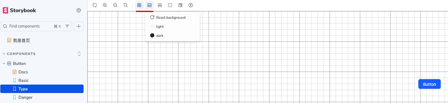
允许用户在 preview.ts 中进行全局配置也可以在某个 story 中进行配置或者使用。
// .storybook/preview.ts
import type { Preview } from '@storybook/react-vite'

const preview: Preview = {
  parameters: {
    // 配置整体的选项
    backgrounds: {
      options: {
        dark: { name: 'Dark', value: '#222' },
        light: { name: 'Light', value: '#fff' },
        gray: { name: 'Gray', value: '#f5f5f5' },
      }
    }
  },
  initialGlobals: {
    // 设置默认的背景主题
    backgrounds: { value: 'gray' }
  }
}
export default preview;
在 story 中也可以控制使用哪个主题,是否展示网格线,是否允许用户切换主题。
const meta = {
  parameters: {
    // disable 则会隐藏主题和网格线的按钮
    backgrounds: { value: 'dark', grid: true, disable: true }
  }
}IMPORTANT
如果需要复杂的配置,比如切换主题、或者增加多语言选项,可以参考 文档
viewport
文档 允许不同的设备尺寸来展示组件。也可以自定义设备尺寸。
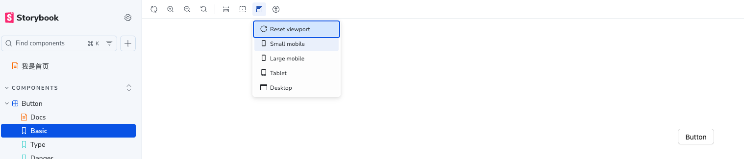
默认选项不是很多,可以通过导入默认配置,重新定义。
// .storybook/preview.ts
import type { Preview } from '@storybook/react-vite'
import { INITIAL_VIEWPORTS } from 'storybook/viewport';

const preview: Preview = {
  parameters: {
    viewport: {
      viewports: DEFAULT_VIEWPORTS,
    }
  },
  initialGlobals: {
    // 设置默认的 viewport
    // isRotated 则会展示旋转后的效果 (横屏 or 竖屏)
    viewport: { value: 'iphone11', isRotated: false }
  }
}
export default preview;
同样支持在 story 中进行配置。
目录调整
meta 中接收一个 title 用来配置目录的名称,默认显示组件的名称。
如果想要实现一个目录的层级结构,需要在 title 中使用 / 来分隔。
比如给不同的 meta 配置不同的 title
// button.stories.tsx
const meta = {
  component: Button,
  title: 'Basic/Button',
}

// input.stories.tsx
const meta = {
  component: Input,
  title: 'Form/Input',
}
loaders 异步数据加载
文档 story 渲染之前运行,加载的数据通过上下文注入到 story 中。
支持全局和非全局配置。
const meta = {
  loaders: [
    async () => {
      const response = await fetch('https://jsonplaceholder.typicode.com/posts');
      return {
        posts: response.json()
      }
    },
  ],
  render: ({ ...args }, { loaded }) => {
    console.log(loaded.posts);
  }
}
UI 调整
支持通过配置,调整边栏、工具栏、参数等区域的显示内容 文档
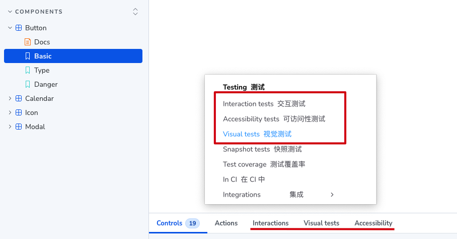
测试