Icon 图标
CAUTION
参考 antd 的实现模式,支持创建创建图表、阿里妈妈图标
图表使用 svg 创建。需要了解以下内容
svg 中的 width 和 height 用来设置图标的大小,一般使用 1em 保证和字体大小一致。
svg 中的 fill 用来设置图标填充颜色。一般使用 currentColor 来继承字体颜色。 字体大小和 currentColor 的配合可以让用户不直接修改 svg 的颜色及大小实现自身的调整
svg 中的 path 用来绘制图标的路径
svg 中的 viewBox 用来设置 svg 元素的可见区域。一般使用 0 0 24 24 来设置。
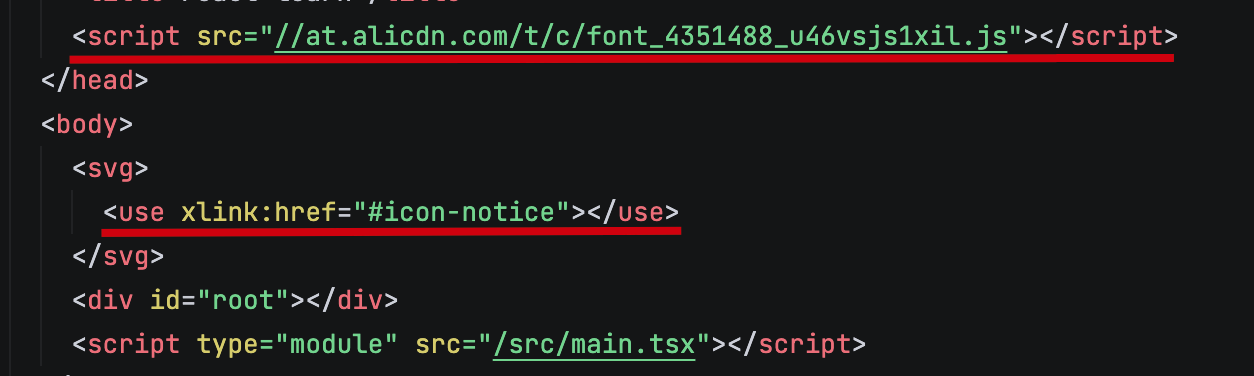
在阿里妈妈中使用 symbol 类型的图标姿势如下:
Icon 基础组件
定义 Icon 组件的类型,使其有自定义属性的同时兼容 svg 本身的各种属性。
tsx
// 19 之后不再需要 forwardRef 直接在 props 中传递 ref
interface BaseIconProps {
  className?: string;
  style?: React.CSSProperties;
  size?: string | string[];
  spin?: boolean;
  ref?: React.Ref<SVGSVGElement>;
}

type IconProps = BaseIconProps &
  Omit<React.SVGProps<SVGSVGElement>, keyof BaseIconProps> &
  React.PropsWithChildren;
通过 className 控制图标是否旋转
ts
import cs from 'classnames';
const Icon: React.FC<IconProps> = (props) => {
const {
className,
style,
size = '1em',
spin,
ref,
children,
viewBox = '0 0 1024 1024',
...restProps
} = props;
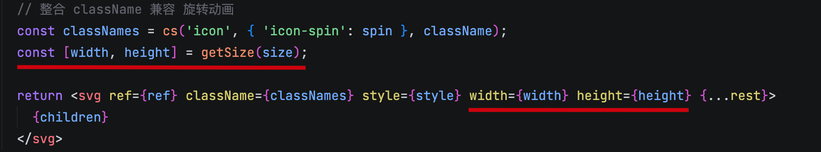
const classNames = cs('icon', className, { 'icon-spin': spin }, className);
return (
<svg
className={classNames}
style={styles}
ref={ref}
viewBox={viewBox}
fill="currentColor"
{...restProps}
>
{children}
</svg>
);
}增加对应的样式内容
css
.icon {
  display: inline-block;
  vertical-align: middle;
}

.icon-spin {
  animation: icon-spin 2s infinite linear;
}

@keyframes icon-spin {
  0% {
    transform: rotate(0deg);
  }
  100% {
    transform: rotate(359deg);
  }
}处理用户传递的 size 属性
ts
const getSize = (size: IconProps['size']) => {
  if (typeof size === 'string') {
    const curSize = size || '1em';
    return [curSize, curSize]
  }
  if (Array.isArray(size) && size.length === 2) {
    return size;
  }
  return ['1em', '1em'];
}
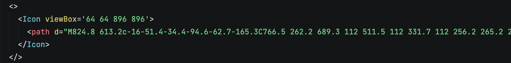
测试使用方案,在 antd 的 icon 中随便找一个复制其 viewBox 和 path 的内容
createIcon 方法
上述方案每次使用后,也是过于繁琐,可以通过增加 createIcon 方法,创建一些 Icon 的预设,让用户可以直接导入对应的 Icon 进行使用。
ts
interface CreateIconProps {
  viewBox?: string;
  content: React.ReactNode;
  iconProps?: IconProps;
}
export const createIcon = (props: CreateIconProps) => {
  const {
    viewBox = '64 64 896 896',
    content,
    iconProps,
  } = props;

  return (runtimeProps: IconProps) => (
    <Icon viewBox={viewBox} {...iconProps} {...runtimeProps}>
      {content}
    </Icon>
  )
}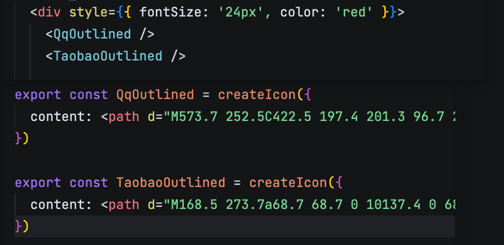
createFromIconfont 方法
核心就是将创建出一个 script 标签放在 head 中,然后使用 Icon 组件传入 children 即可。
tsx
const loadedUrls = new Set<string>();
export const createFromIconFont = (scriptUrl?: string) => {
  if (scriptUrl && !loadedUrls.has(scriptUrl)) {
    const script = document.createElement('script');
    script.src = scriptUrl;
    document.head.appendChild(script);
    loadedUrls.add(scriptUrl);
  }

  return (props: IconProps) => {
    const { type, ...rest } = props;
    return <Icon {...rest}>{ type ? <use xlinkHref={`#${type}`} /> : null }</Icon>
  }
}