DatePickerPanel 日期选择面板
CAUTION
开始之前,补充一点 Date API 的知识。
ts
/**
 * 创建年月份
 * 月,从 0 开始
 */
new Date(2025, 11, 1) // Thu Jan 01 2026 00:00:00 GMT+0800 (中国标准时间)

// toLocaleString 方法可以将日期对象转换为本地时间字符串。
new Date(2025, 11, 1).toLocaleString() // '2025/12/1 00:00:00'

// 第三个参数接受 1-31 之间的整数
// 假设本月 30 天,输入 31 增加到次月 1 号
// 传 0 则是上月的最后一天 -1 上月最后 2 天以此类推
new Date(2025, 10, 0).toLocaleString() // '2025/10/31 00:00:00'
new Date(2025, 10, -1).toLocaleString() // '2025/10/30 00:00:00'

// getFullYear 获取年份
// getMonth 获取月份,从 0 开始
// getDate 获取日期,1-31 之间的整数
// getDay 获取星期,从 0 开始,0 表示星期日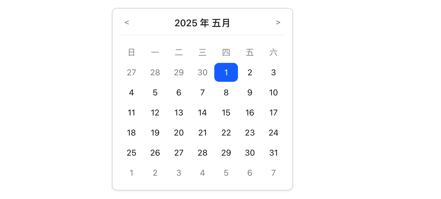
INFO
- 支持上一月、下一月切换
- 支持实例获取及设置 date
- 支持受控、非受控模式
- 支持日期的循环渲染,当月日期黑色、非当月日期灰色、选中日期高亮
- 点击灰色日期,切换到对应月份的对应日期
基准 jsx 与样式如下:
ts
const DatePickerPanel: React.FC = () => {
return <div className="calendar">
<div className="header">
<button ><</button>
<div>2025 年 1 月</div>
<button >></button>
</div>
<div className="days">
<div className="day">日</div>
<div className="day">一</div>
<div className="day">二</div>
<div className="day">三</div>
<div className="day">四</div>
<div className="day">五</div>
<div className="day">六</div>
<div className="prev day">28</div>
<div className="prev day">29</div>
<div className="prev day">30</div>
<div className="prev day">31</div>
{
Array.from({ length: 30 }).map((_, index) =>
// 假数据的判定
<div key={index} className={index === 2 ? 'day selected' : 'day'}>
{index + 1}
</div>)
}
{
Array.from({ length: 6 }).map((_, index) =>
<div key={index} className='next day'>{index + 1}</div>)
}
</div>
</div>
}css
/* Ant Design 风格的颜色变量 */
:root {
  --ant-primary-color: #1677ff; /* 默认主色 */
  --ant-text-color: rgba(0, 0, 0, 0.88); /* 主要文字颜色 */
  --ant-text-color-secondary: rgba(0, 0, 0, 0.45); /* 次要文字颜色 */
  --ant-border-color: #d9d9d9; /* 边框颜色 */
  --ant-bg-container: #fff; /* 背景色 */
  --ant-border-radius: 8px; /* 默认圆角 */
}

.calendar {
  width: 280px; /* 适当的宽度 */
  background-color: var(--ant-bg-container);
  border: 1px solid var(--ant-border-color);
  border-radius: var(--ant-border-radius);
  padding: 12px; /* 增加内边距 */
}

/* --- Header 样式 --- */
.header {
  display: flex;
  justify-content: space-between;
  align-items: center;
  margin-bottom: 12px;
  padding-bottom: 8px;
  border-bottom: 1px solid #f0f0f0; /* 分隔线 */
}

.header div {
  font-size: 16px;
  font-weight: 500;
  color: var(--ant-text-color);
}

.header button {
  background: none;
  border: none;
  cursor: pointer;
  padding: 4px 8px;
  color: var(--ant-text-color-secondary);
  font-size: 14px;
  line-height: 1;
  transition: color 0.3s;
  border-radius: 4px;
}
.header button:hover {
  color: var(--ant-primary-color);
  background-color: rgba(0, 0, 0, 0.03);
}
.header button:active {
  background-color: rgba(0, 0, 0, 0.08);
}

/* --- Days Grid 样式 --- */
.days {
  display: grid;
  grid-template-columns: repeat(7, 1fr);
  text-align: center;
}
.day {
  height: 32px;
  line-height: 32px;
  font-size: 14px;
  color: var(--ant-text-color);
  user-select: none;
  box-sizing: border-box;
  margin: 1px 0;
}

/* 1. 星期标题行样式 (前7个元素,不可点击) */
.days > .day:nth-child(-n+7) {
  color: var(--ant-text-color-secondary);
  font-weight: 400;
  cursor: default;
}

/* 2. 日期单元格基准样式 (从第8个元素开始) */
.days > .day:nth-child(n+8) {
  display: flex;
  justify-content: center;
  align-items: center;
  position: relative;
}

/* =================================================== */
/* 3. 新增:上月 (prev) 和 下月 (next) 日期样式 */
/* 使用次要文字颜色,并移除 hover 效果(或仅改变鼠标指针) */
.day.prev,
.day.next {
  color: var(--ant-text-color-secondary);
  cursor: pointer; /* 保持可点击跳转月份的交互 */
  background-color: transparent !important; /* 确保没有背景色 */
}

/* 4. 上月/下月日期的 hover 效果:只改变指针,不改变背景色(更简洁) */
.day.prev:hover,
.day.next:hover {
    background-color: #f5f5f5; /* 保持与本月非选中日期的 hover 颜色一致 */
    border-radius: var(--ant-border-radius);
}

/* 5. 可点击日期单元格的 Hover 效果 (仅针对本月日期) */
.days > .day:nth-child(n+8):not(.prev):not(.next):not(.selected):hover {
  background-color: #f5f5f5;
  border-radius: var(--ant-border-radius);
}

/* 6. 选中日期样式 (selected) */
.day.selected {
  color: #fff;
  background-color: var(--ant-primary-color) !important;
  border-radius: var(--ant-border-radius);
}月份的切换
ts
const monthNames = ['一月', '二月', '三月', '四月', '五月', '六月', '七月', '八月', '九月', '十月', '十一月', '十二月'];
const DatePickerPanel: React.FC = () => {
// 维护一个标准的日期状态
const [date, setDate] = useState(new Date());
// 通过标准状态月份的 +- 1 实现月份的切换
const handlePrevMonth = () => {
setDate(new Date(date.getFullYear(), date.getMonth() - 1, 1));
}
const handlePrevMonth = () => {
setDate(new Date(date.getFullYear(), date.getMonth() + 1), 1);
}
return <div className="calendar">
<div className="header">
<button onClick={handlePrevMonth}><</button>
<div>{date.getFullYear()} 年 {monthNames[date.getMonth()]}</div>
<button onClick={handleNextMonth}>></button>
</div>
{/* TODO 渲染日期网格 */}
</div>
}日期的渲染
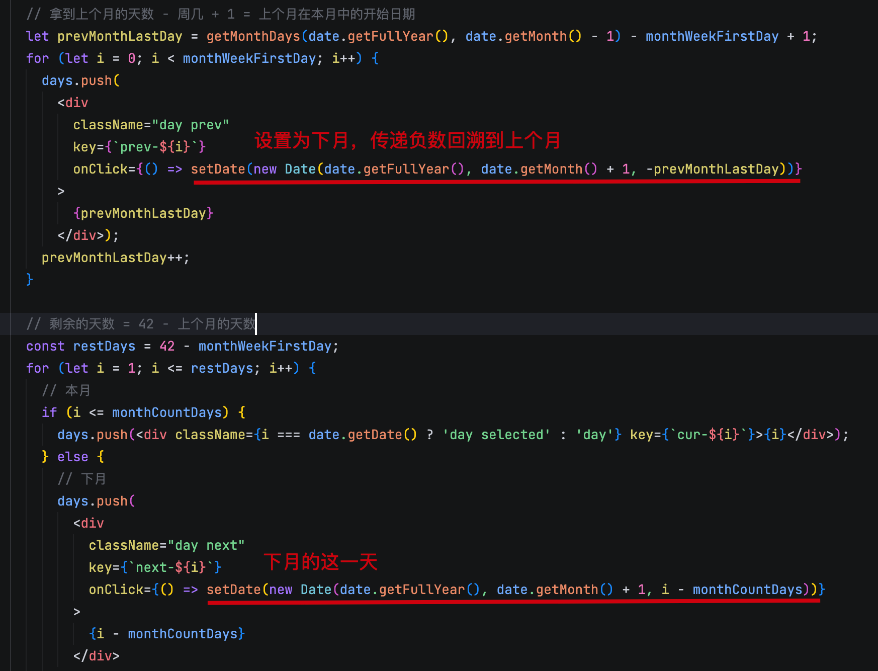
渲染日期时有几个关键数据的计算,需要注意:
- 每个月的天数,每个月的第一天是周几
- 上个月和下个月的日期分别有几天
- 定下渲染的行数 6 行 7 列
ts
/**
 * 获取指定月份的天数
 */
const getMonthDays = (year: number, month: number) => new Date(year, month + 1, 0).getDate();
/**
 * 获取指定月份的第一天是周几
 */
const getMonthWeekFirstDay = (year: number, month: number) => new Date(year, month, 1).getDay();

const DatePickerPanel: React.FC = () => {
  const [date, setDate] = useState(new Date());

  const renderDays = () => {
    const days = [];
    // 当前月份的天数
    const monthCountDays = getMonthDays(date.getFullYear(), date.getMonth());
    // 当前月份的第一天是周几
    const monthWeekFirstDay = getMonthWeekFirstDay(date.getFullYear(), date.getMonth());

    // 拿到上个月的天数 - 周几 + 1 = 上个月在本月中的开始日期
    let prevMonthLastDay = getMonthDays(date.getFullYear(), date.getMonth() - 1) - monthWeekFirstDay + 1;
    for (let i = 0; i < monthWeekFirstDay; i++) {
      days.push(<div className="day prev" key={i}>{prevMonthLastDay}</div>);
      prevMonthLastDay++;
    }

    // 剩余的天数 = 42 - 上个月的天数
    const restDays = 42 - prevMonthLastDay;
    for (let i = 1; i <= restDays; i++) {
      // 本月
      if (i <= monthCountDays) {
        days.push(<div className="day" key={i}>{i}</div>);
      } else {
        // 下月
        days.push(<div className="day next" key={i}>{i - monthCountDays}</div>);
      }
    }
    return days;
  }

  return <div className="calendar">
    {/* header ... */}
    <div className="days">
      {renderDays()}
    </div>
  </div>
}
实例方法与当前日期高亮
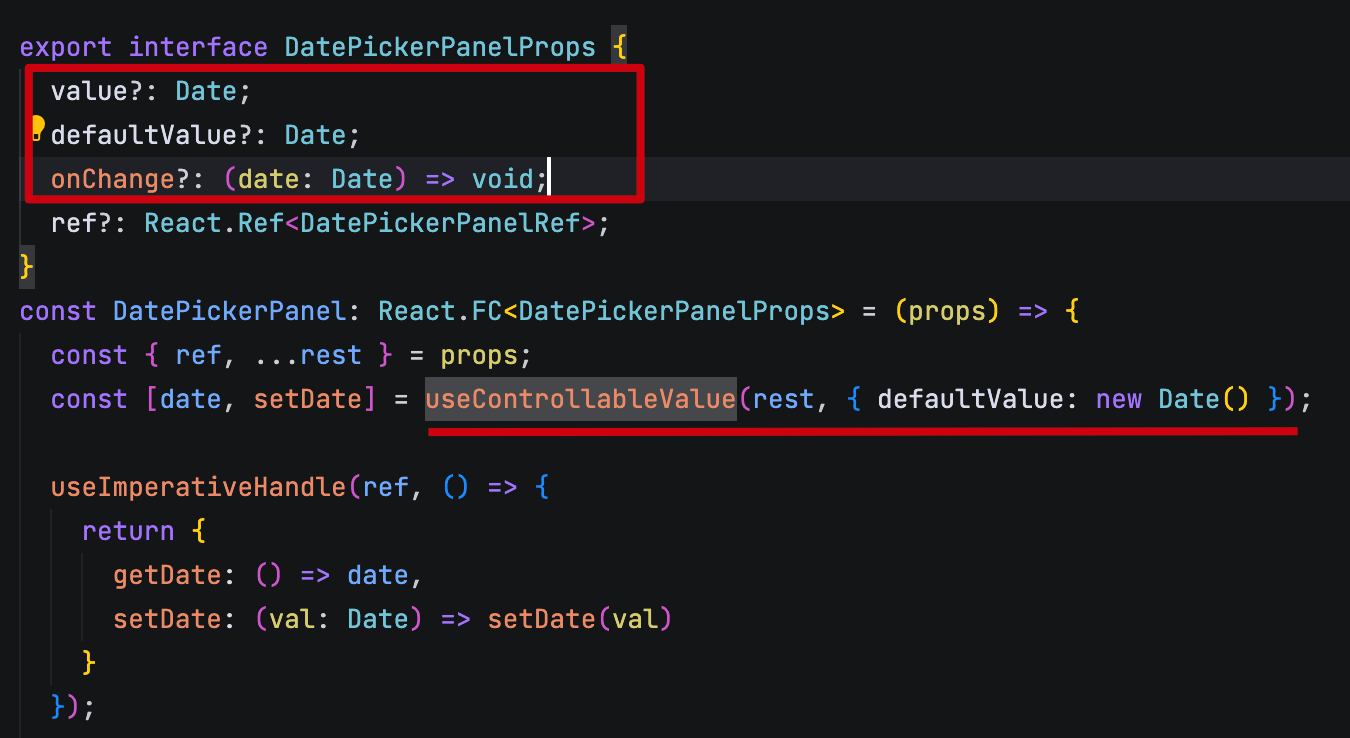
受控模式的支持
使用 ahooks 中的 useControllableValue 实现受控与非受控模式的支持。
bash
pnpm add ahooks增加 value defaultValue onChange 属性;
将组件内部原有的 useState 替换为 useControllableValue。
每次 setDate 是否受控,交由 ahooks 中的 useControllableValue 处理。
灰色日期的点击
完整代码及测试
tsx
import DatePickerPanel, type { DatePickerPanelRef } from './components/DatePickerPanel';

const App = () => {
  const [date, setDate] = useState(new Date());
  const calendarRef = useRef<DatePickerPanelRef>(null)

  useEffect(() => {
    setTimeout(() => {
      calendarRef.current?.setDate(new Date('2024-08-01'));
    }, 3000);
  }, []);

  return <>
    {/* 非受控模式 */}
    <DatePickerPanel defaultValue={new Date()} ref={calendarRef} />
    {/* 受控模式 */}
    <DatePickerPanel value={date} onChange={(val) => setDate(val)} />
  </>
}
tsx
import { useImperativeHandle } from 'react';
import { useControllableValue } from 'ahooks';
import './index.css';
const monthNames = ['一月', '二月', '三月', '四月', '五月', '六月', '七月', '八月', '九月', '十月', '十一月', '十二月'];
/**
* 获取一个月的天数
*/
const getMonthDays = (year: number, month: number) => new Date(year, month + 1, 0).getDate();
/**
* 获取一个月的第一天是周几
*/
const getMonthWeekFirstDay = (year: number, month: number) => new Date(year, month, 1).getDay();
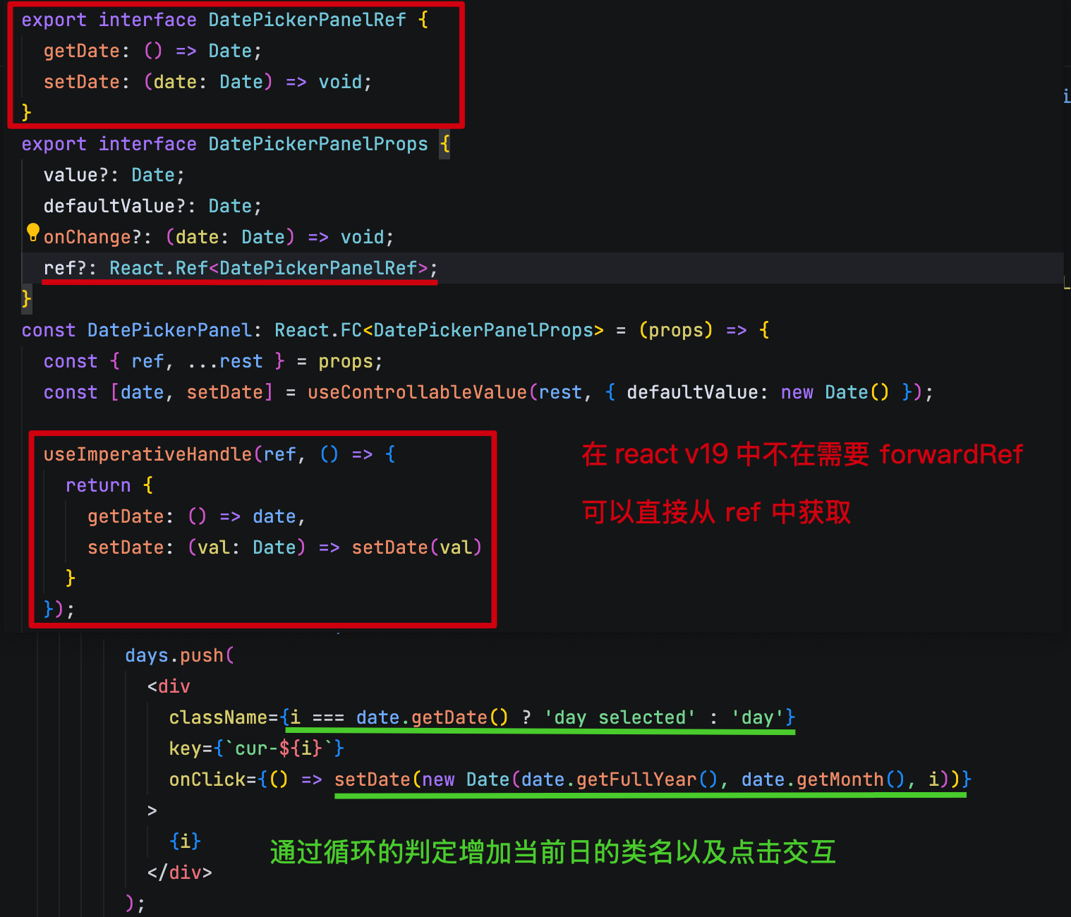
export interface DatePickerPanelRef {
getDate: () => Date;
setDate: (date: Date) => void;
}
export interface DatePickerPanelProps {
value?: Date;
defaultValue?: Date;
onChange?: (date: Date) => void;
ref?: React.Ref<DatePickerPanelRef>;
}
const DatePickerPanel: React.FC<DatePickerPanelProps> = (props) => {
const { ref, ...rest } = props;
const [date, setDate] = useControllableValue(rest, { defaultValue: new Date() });
useImperativeHandle(ref, () => {
return {
getDate: () => date,
setDate: (val: Date) => setDate(val)
}
});
const renderDays = () => {
const days = [];
// 当前月份的天数
const monthCountDays = getMonthDays(date.getFullYear(), date.getMonth());
// 当前月份的第一天是周几
const monthWeekFirstDay = getMonthWeekFirstDay(date.getFullYear(), date.getMonth());
// 拿到上个月的天数 - 周几 + 1 = 上个月在本月中的开始日期
let prevMonthLastDay = getMonthDays(date.getFullYear(), date.getMonth() - 1) - monthWeekFirstDay + 1;
for (let i = 0; i < monthWeekFirstDay; i++) {
days.push(
<div
className="day prev"
key={`prev-${i}`}
onClick={() => setDate(new Date(date.getFullYear(), date.getMonth() + 1, -prevMonthLastDay))}
>
{prevMonthLastDay}
</div>);
prevMonthLastDay++;
}
// 剩余的天数 = 42 - 上个月的天数
const restDays = 42 - monthWeekFirstDay;
for (let i = 1; i <= restDays; i++) {
// 本月
if (i <= monthCountDays) {
days.push(
<div
className={i === date.getDate() ? 'day selected' : 'day'}
key={`cur-${i}`}
onClick={() => setDate(new Date(date.getFullYear(), date.getMonth(), i))}
>
{i}
</div>
);
} else {
// 下月
days.push(
<div
className="day next"
key={`next-${i}`}
onClick={() => setDate(new Date(date.getFullYear(), date.getMonth() + 1, i - monthCountDays))}
>
{i - monthCountDays}
</div>
);
}
}
return days;
}
const handlePrevMonth = () => {
setDate(new Date(date.getFullYear(), date.getMonth() - 1, 1));
}
const handleNextMonth = () => {
setDate(new Date(date.getFullYear(), date.getMonth() + 1, 1));
}
return <div className="calendar">
<div className="header">
<button onClick={handlePrevMonth}><</button>
<div>{date.getFullYear()} 年 {monthNames[date.getMonth()]}</div>
<button onClick={handleNextMonth}>></button>
</div>
<div className="days">
<div className="day">日</div>
<div className="day">一</div>
<div className="day">二</div>
<div className="day">三</div>
<div className="day">四</div>
<div className="day">五</div>
<div className="day">六</div>
{renderDays()}
</div>
</div>
}
export { DatePickerPanel }
export default DatePickerPanel